
Avalanche Cafe Style
Wake up and smell the coffee
Wake up and smell the coffee. When we first met our clients Stefan and Paul, their vision was to reinvent Avalanche and build more personality into an already successful, but slightly tired brand. From the outset Curious’ mantra for the project was ‘Avalanche starts with an A, and so does Attitude’. This not only created the driving idea, but it also eventually steered us down a path where the ‘A’ was to become a hugely important graphic component for not only the brand identity, but also packaging and communications.
This strategic thinking laid a solid foundation for the brand architecture, but additional personality was absolutely essential to provide Avalanche with a totally unique point of view. This was duly achieved by collaborating with Joseph Carrington from Moses Illustration to create whimsical black and white illustrations that interconnect with the dominant ‘A’ icon.


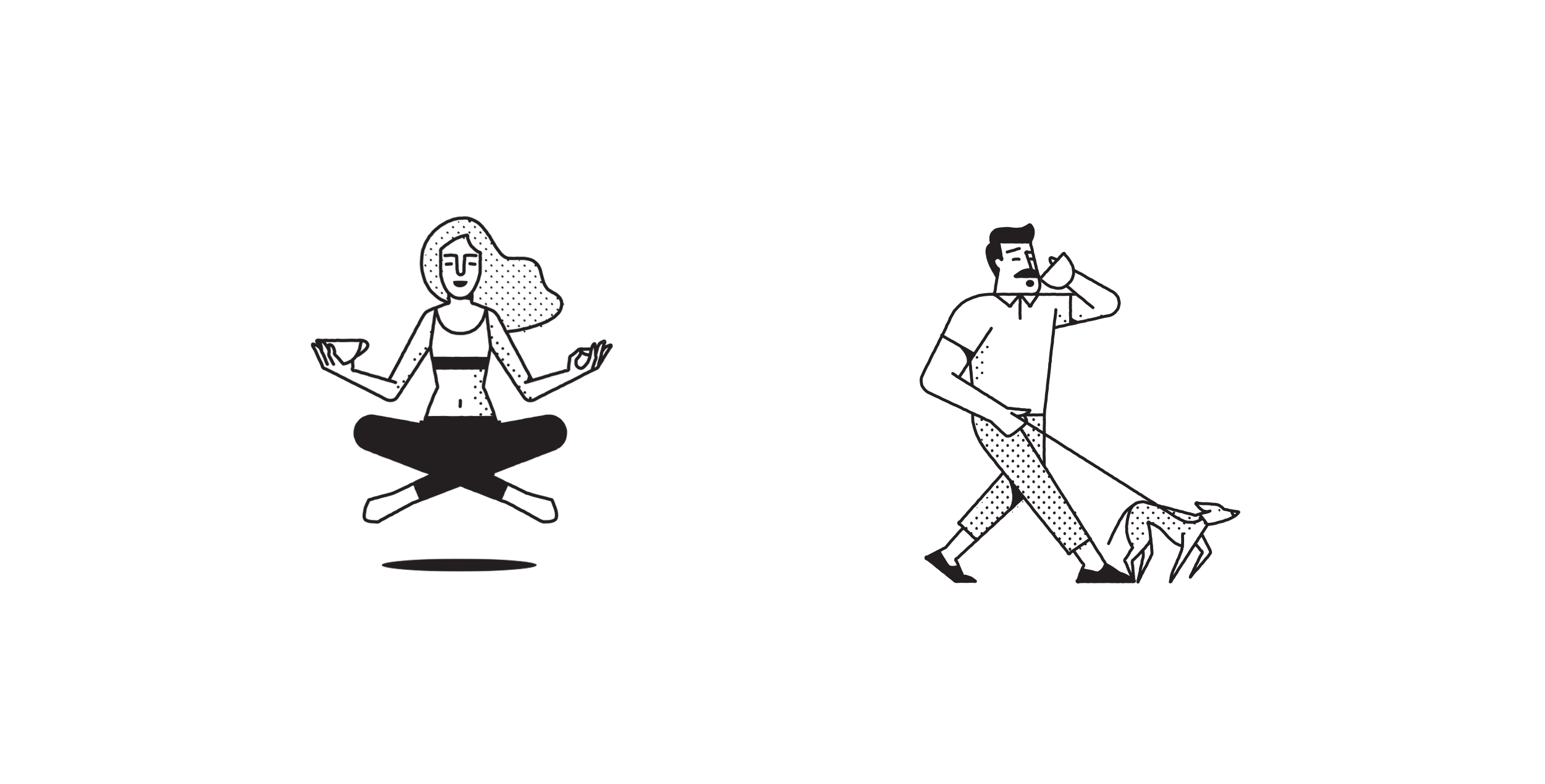

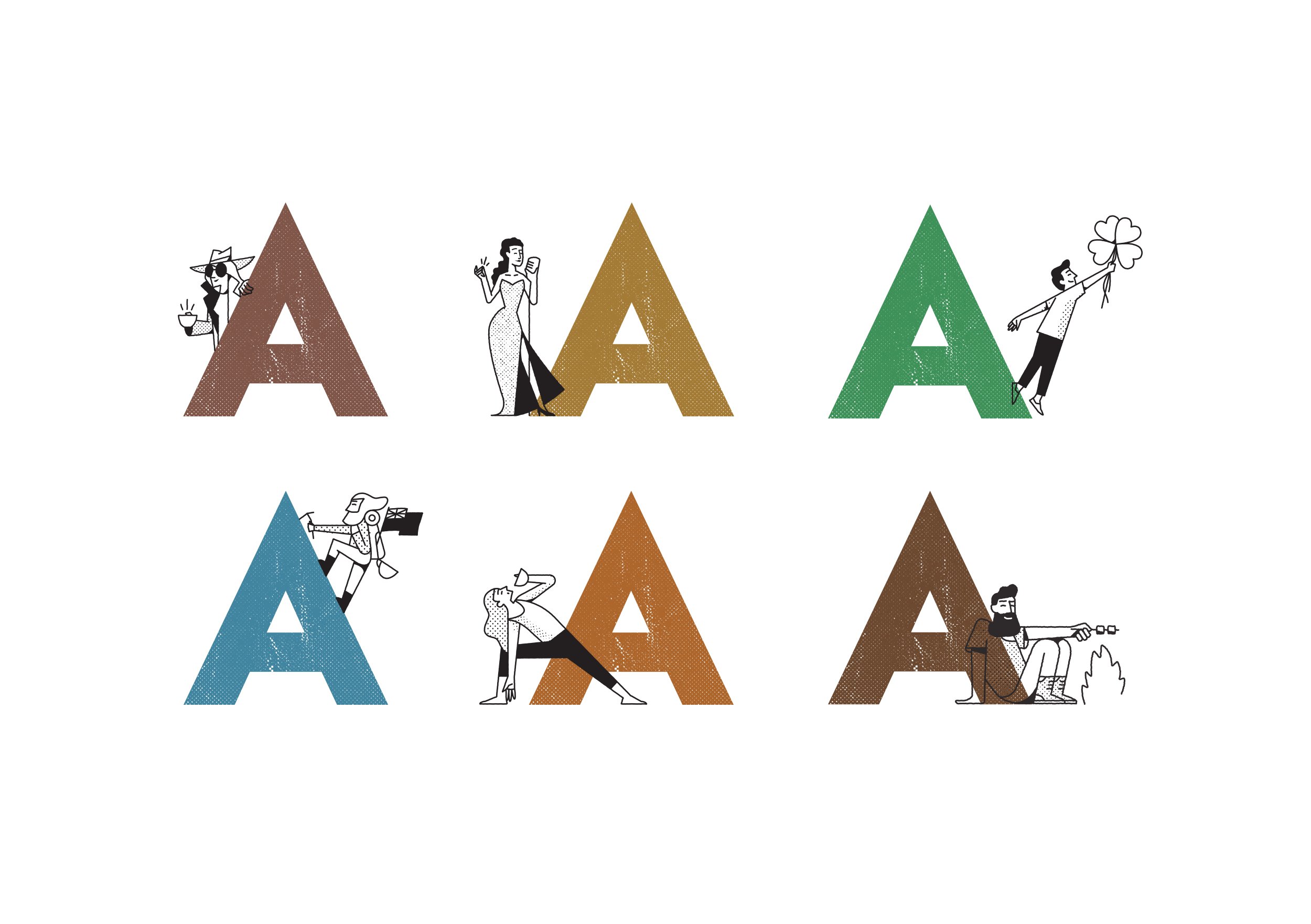
From figures leaping off diving boards for the Plunger range through to a voluptuous chanteuse personifying the silky smooth Café Style Caramel Latte, every image was thoughtfully explored and realised.
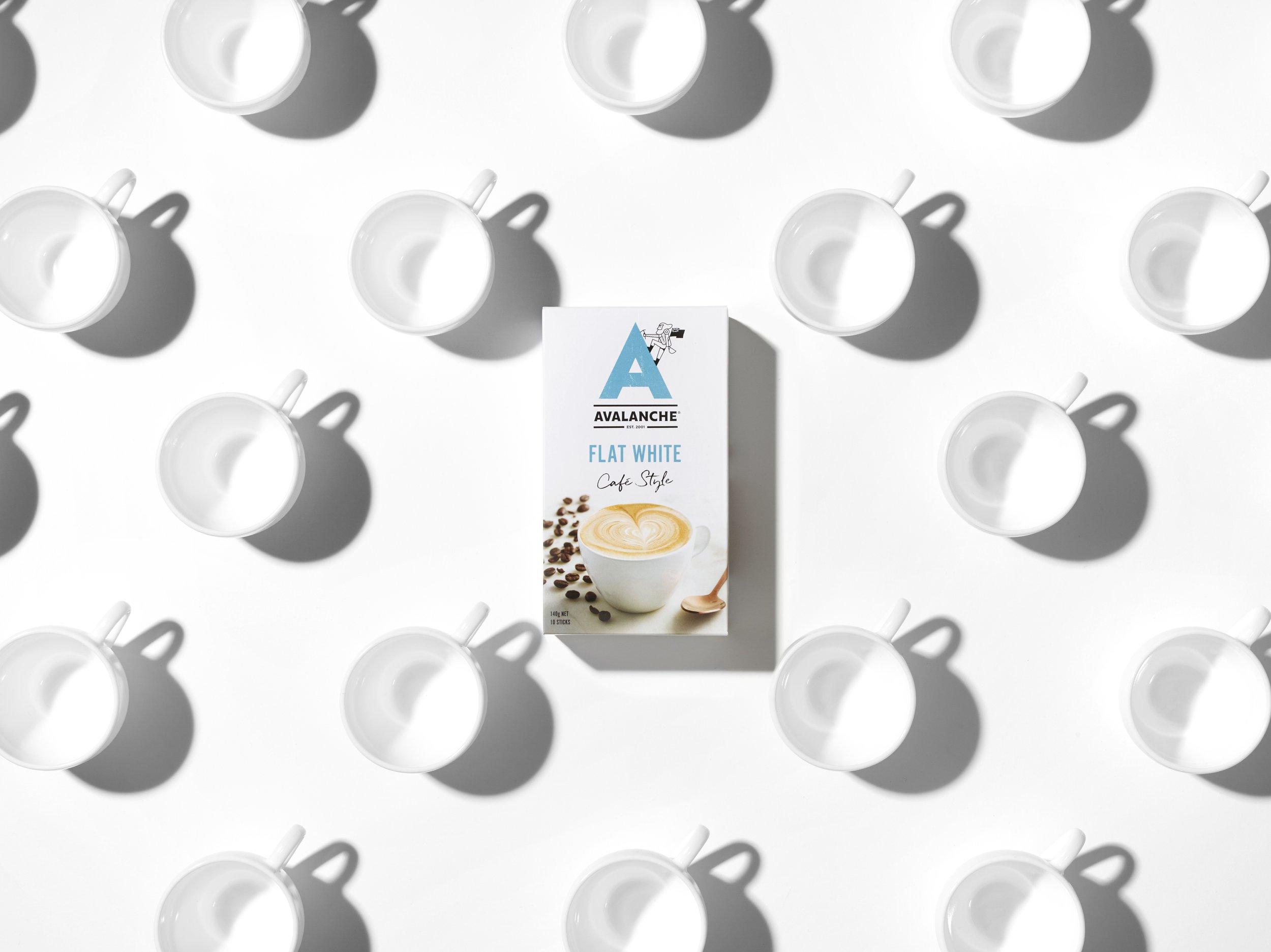
The final graphic ingredients for the packaging were then formulated and incorporated. Beautifully styled photography of the products set in a contemporary, white, café style environment created appetite appeal and cleverly crafted copy was introduced to match the brand tone of voice to the visual storytelling.
All in all, a landslide success!