
Kapiti
Ice cream meets art meets nature
Kapiti Ice Cream consumers are spontaneous and adventurous with their food choices. They are explorers who seek a taste discovery, a sensory experience that satisfies their curiosity and represents their self expression. But they also demand that Kapiti maintains its true value of being locally crafted with natural, premium quality ingredients.
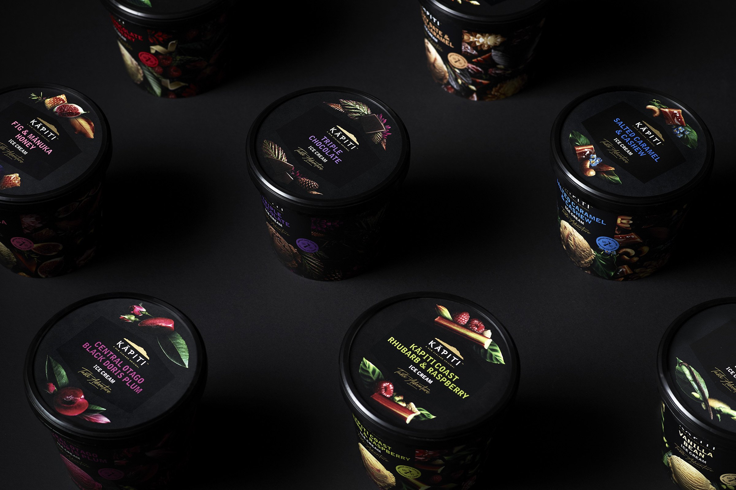
Curious’ challenge was to bring this ‘taste adventure’ positioning to life across the range of packaging and POS. Enticing consumers to purchase Kapiti Ice Cream ahead of its competitors. Irresistible food cues combined with elements of nature were identified as the key visual drivers for the packaging, so each ice cream has a sumptuous combination of these components to reflect the individual taste profiles and indulgence levels. These were all beautifully photographed and composed on a Kapiti signature black background.

And then came the ‘art’ component. Our main goal was to avoid introducing cliched and traditional ways of representing art, so we explored slightly more esoteric interpretations. Out of this research we came across an enlightening article about the kaleidoscope. Although at face value it’s a timeless child’s toy that creates beautiful abstract images, which was a really captivating concept in its own right, it also possesses a philosophical symbolism.
‘The kaleidoscope represents the initiative we all must take to sustain beauty in our lives and land in the right place, as life continues to change and we are continually challenged. Things fall apart sometimes, but they can always be put back together again, achieving ultimate beauty with a new look, but only if we hold it up to the light and look inside.’ -K Makovsky
This sentiment not only mirrors the adventurous spirit of the Kapiti Ice Cream consumer, but visually we have also used this analogy to create a contemporary and distinctive edge to the design.
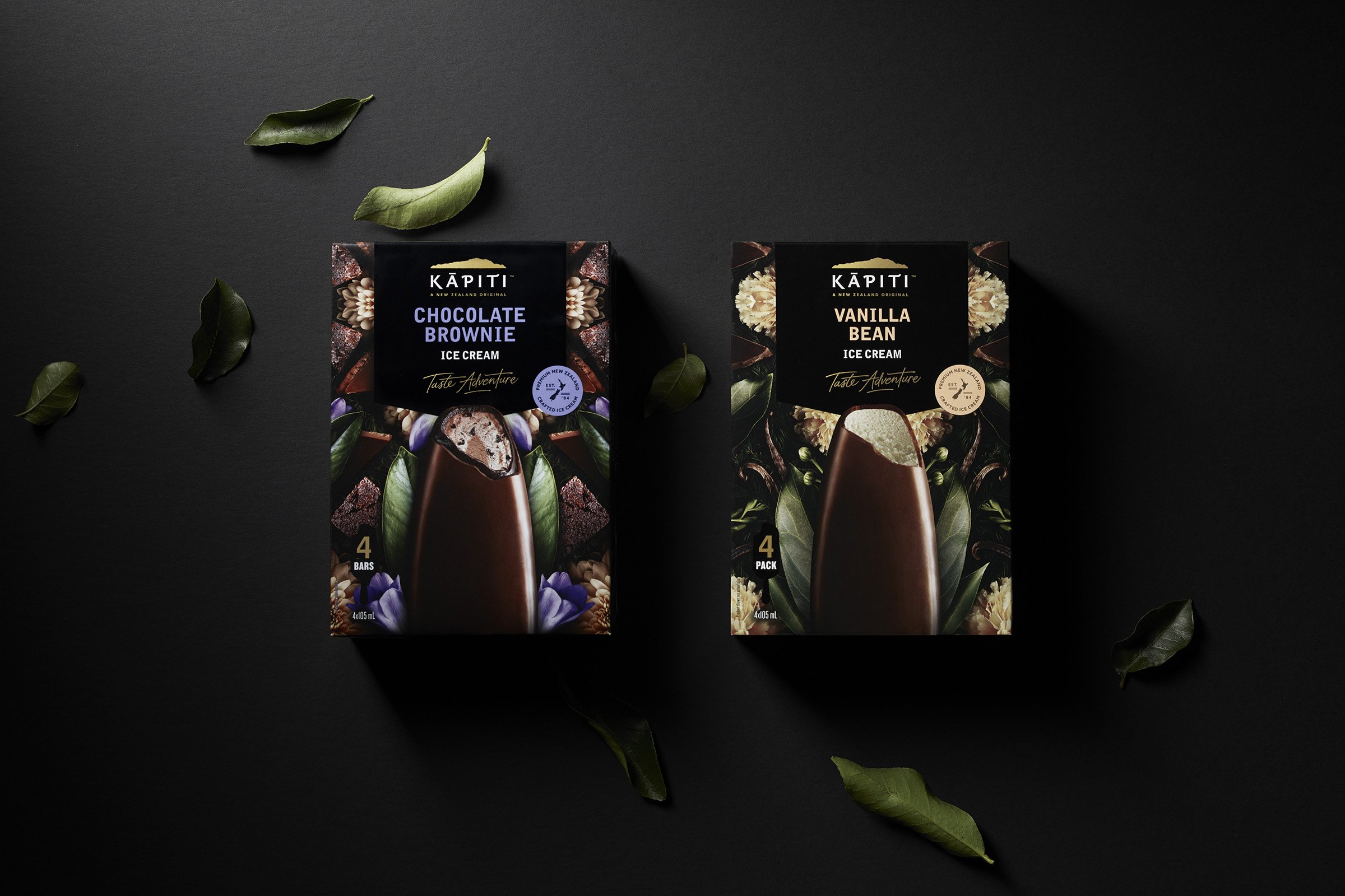
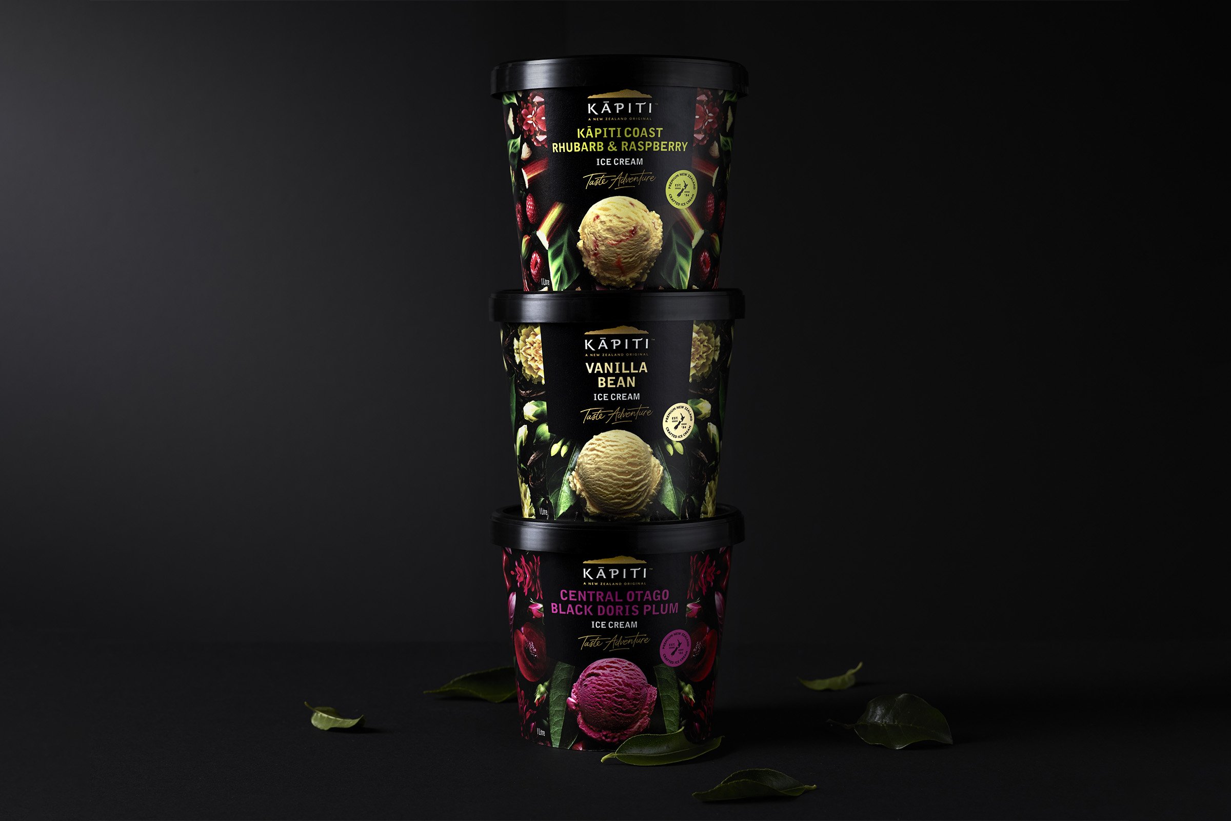

Our final consideration was based around retaining the authenticity of the brand. With such a change in the overall design architecture, we felt that it was essential to maintain the existing Kapiti logo as a distinctive brand asset. The only slight change being that the island icon has been altered from silver to gold to add richer and more premium cues. A supporting ‘marque’ was also introduced to celebrate the provenance, heritage and craft values of Kapiti.