
Shepherd’s Ridge
Landscape expressions
Upon the landmark Wither Hills lies Shepherd’s Ridge, overlooking Marlborough’s stunning Wairau Valley. Crafted in the belief that exceptional wines are created in the vineyard, the Shepherd’s Ridge name symbolises the dedication to these unique vineyard sites.
Curious’ brief was to create a visual embodiment for this premium, on-premise exclusive brand. The inspiration for the design was the winery’s incredibly unique landscape. Upon the landmark Wither Hills lies Shepherd’s Ridge, overlooking Marlborough’s stunning Wairau Valley. Crafted in the belief that exceptional wines are created in the vineyard, the Shepherd’s Ridge name symbolises the dedication to these unique vineyard sites.

However, rather than featuring the traditional geographical features of the Marlborough region or a cliched reference to a shepherd, we decided to create a much more abstract interpretation that evoked the origins and culture of the wine.
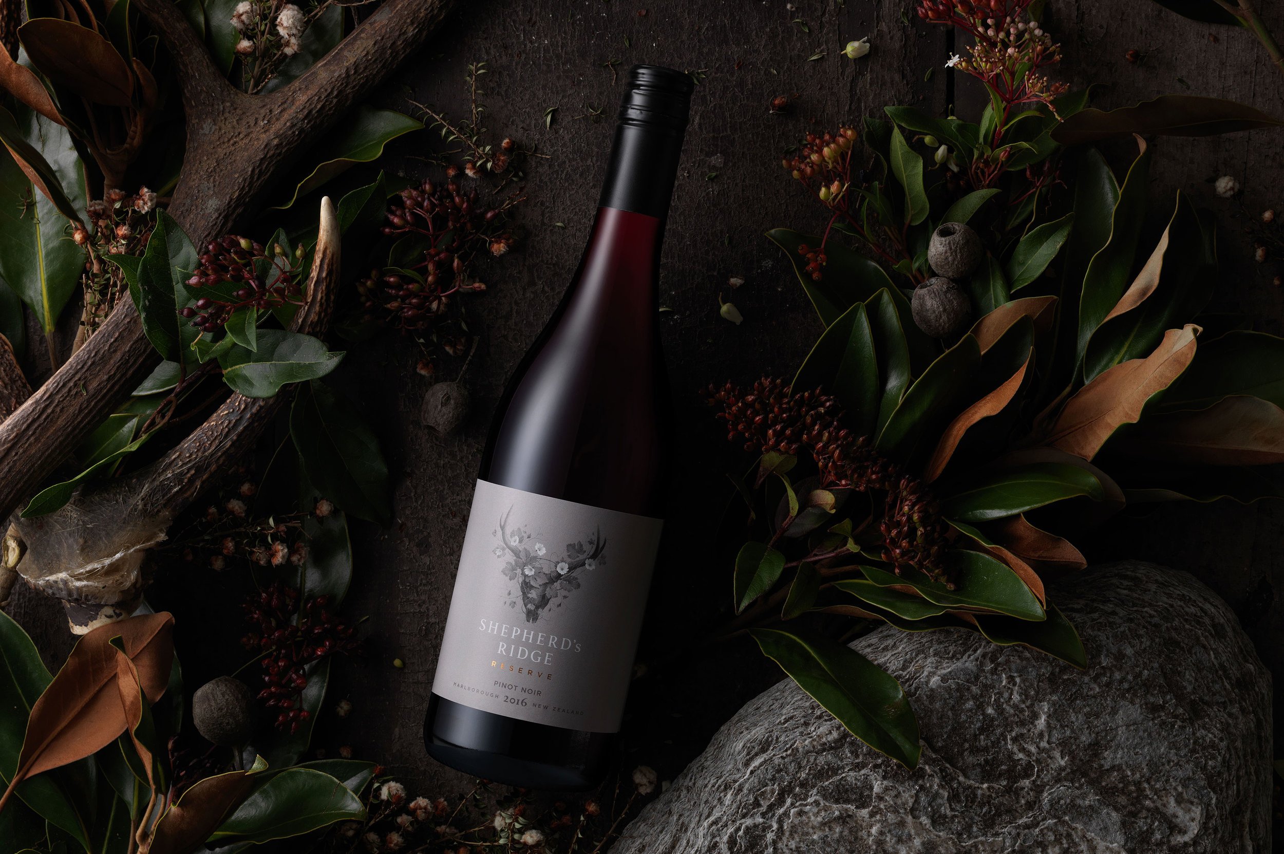
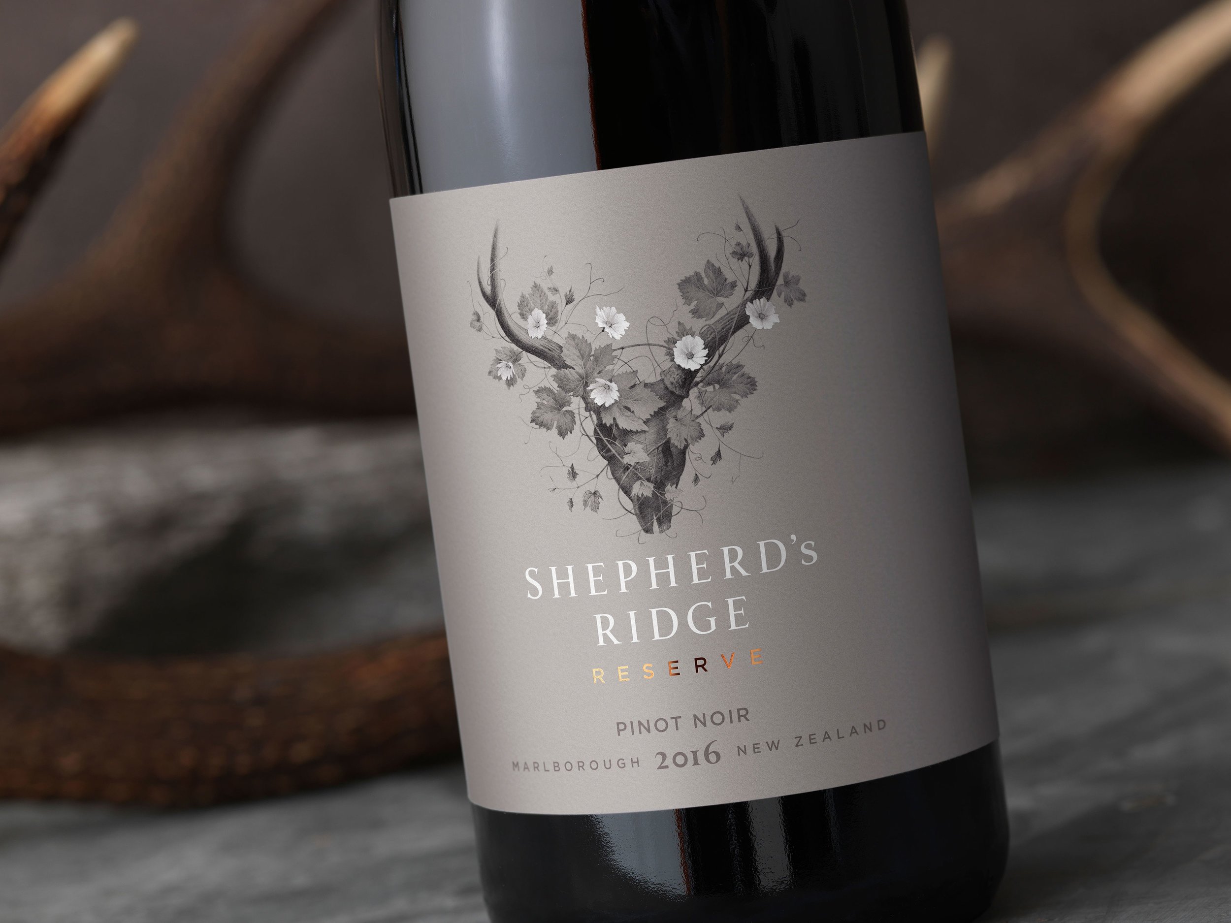
Animal skulls can be found adorning many South Island houses and cribs, but they are more than ornaments-they are symbols of respect for the creatures that have often sustained life and worked in harmony with the land. To Curious, this was a perfect analogy for the Shepherd’s Ridge vineyards. A sense of regeneration was then also introduced to build in an extra layer of story telling. This was achieved by elegantly interlacing natural vegetation around the iconic skull shape.
Anton Petrov from Watermark Creative captured our vision perfectly with a beautifully understated illustration. It’s simple black and white colour palette and strong sense of structure creates a very powerful image base-but this was then delicately balanced with the flowing cursive lines of vines, leaves and flowers.
To complement this iconography, we chose to incorporate subtle warm grey hues and copper foil to add premium cues and a discreet pop of colour. The typography has also been sensitively handled to enhance the sophistication of the label.
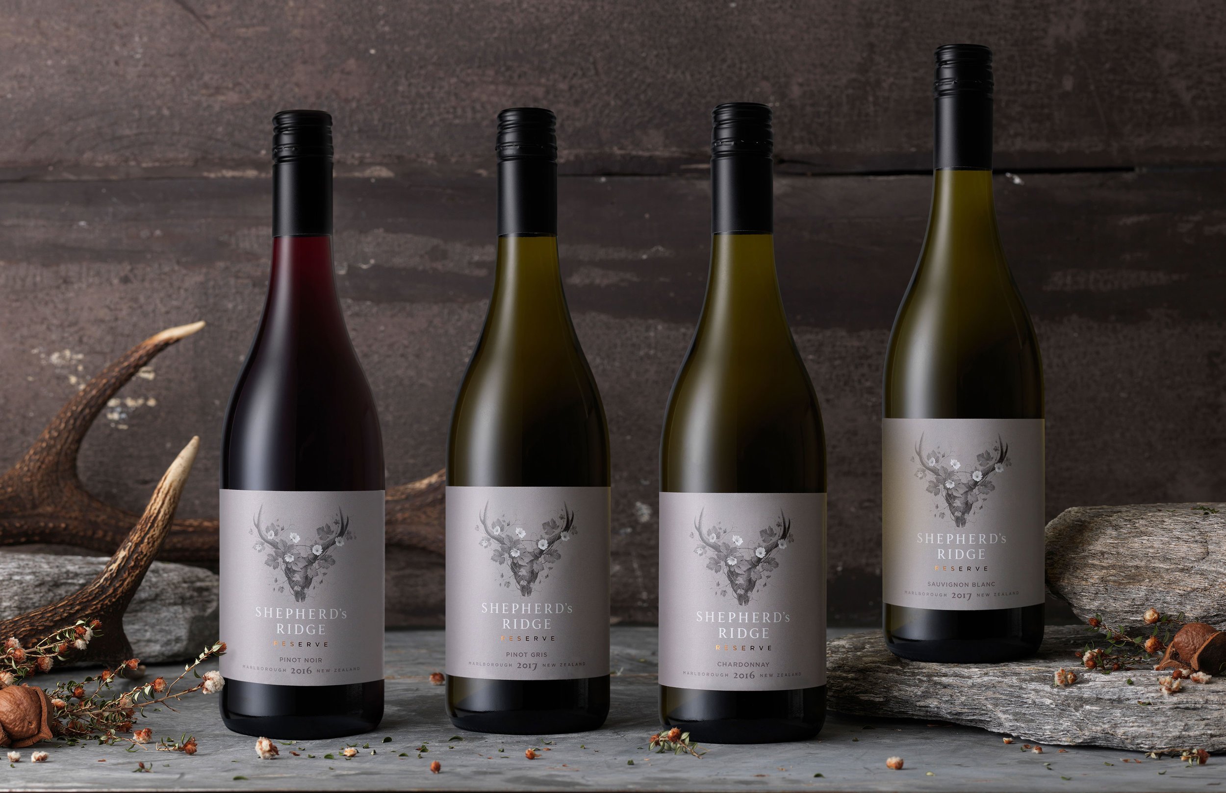
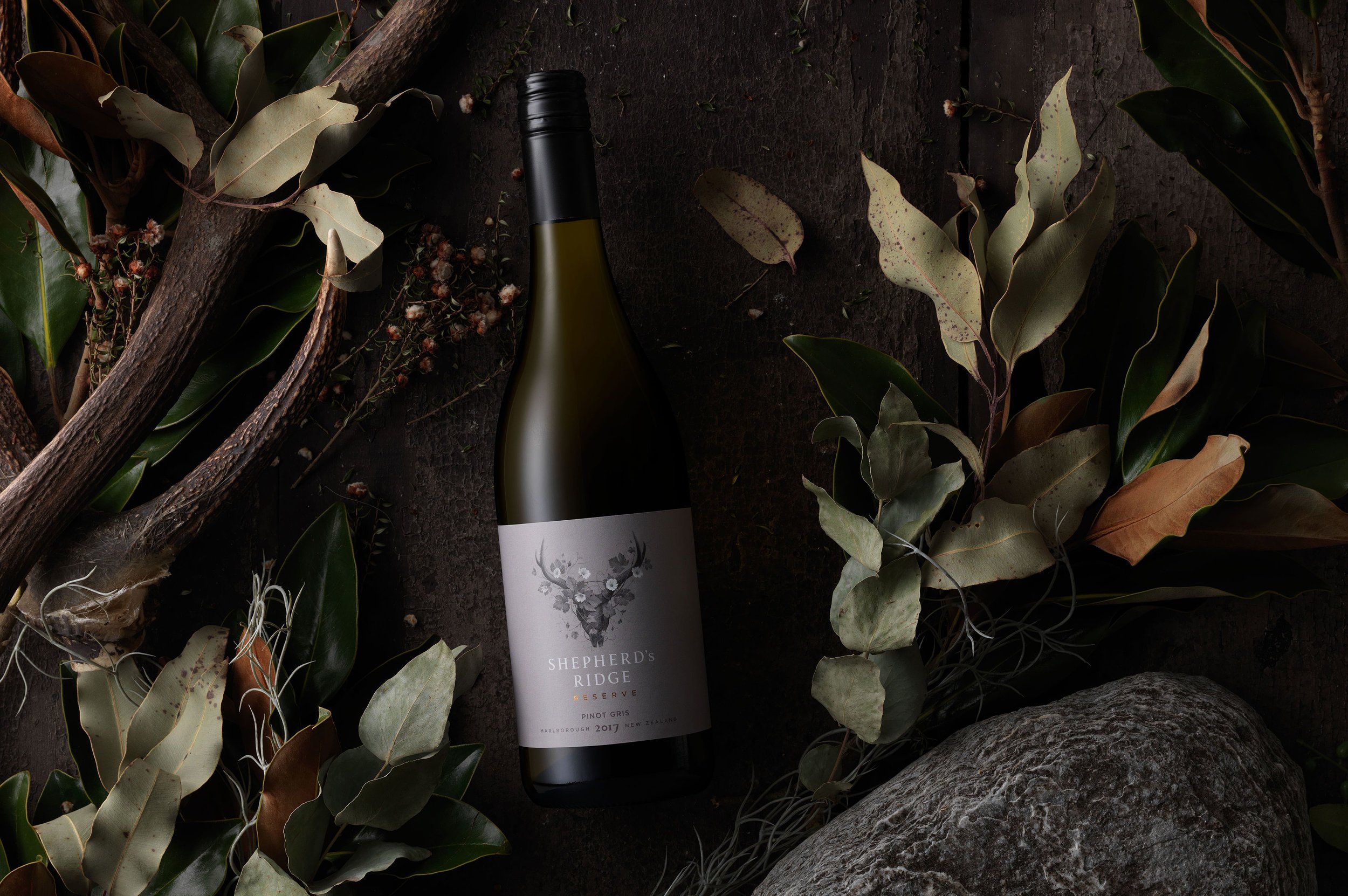
Once the primary packaging had been established, we then moved on to creating a suite of imagery that could be used for all forms of media. Given that Shepherd’s Ridge Reserve is a totally new brand, it was important to feature the bottle and label-as this would allow the consumer to create a strong visual connection at point of purchase. However we also wanted to ensure that there was a symbiotic relationship between the packaging and its origins, so each varietal was surrounded by colour co-ordinated flora and natural stone. The subtle lighting and earthy tones then completed the narrative.